|

Commercial Colour Consulting Projects > Magic Moments Daycare
Magic Moments Daycare Project
Consulting for Colour for Children
 This is one of our favorite projects. This daycare centre was a truly interesting project. Frida LaCaria is the owner and principal of this beautiful facility in downtown Toronto. It took five years of planning and hard work from original idea to completion. Frida’s vision for this daycare, well situated near Avenue Road and Eglinton Avenue, was born from the difficulties she discovered in finding a suitable daycare facility for her own son. This is one of our favorite projects. This daycare centre was a truly interesting project. Frida LaCaria is the owner and principal of this beautiful facility in downtown Toronto. It took five years of planning and hard work from original idea to completion. Frida’s vision for this daycare, well situated near Avenue Road and Eglinton Avenue, was born from the difficulties she discovered in finding a suitable daycare facility for her own son.
Although the building is all newly built, the styling, materials and finish details were chosen to recreate the feeling of a grand old house. It is a fanastic facility – well though out for it’s daily purpose.
 Frida started looking for a paint colour consultant in Toronto to help with the colour selections & someone told her about our service .We were brought in when all the walls were already up, so the place was taking shape… but the final touches were still to be applied. Although we use the psychology of colour in all our projects, this one required specific study of paint colours favored by children six years old & under. Frida started looking for a paint colour consultant in Toronto to help with the colour selections & someone told her about our service .We were brought in when all the walls were already up, so the place was taking shape… but the final touches were still to be applied. Although we use the psychology of colour in all our projects, this one required specific study of paint colours favored by children six years old & under.
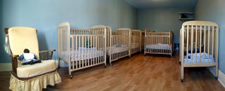
The theory of colour dictated that we should maintain variety in the palette, but the psychology of colour for children indicated that we use a lot of warmth in what we selected. You’ll see in the nursery, although the walls are blue (to calm the infants) it is, in fact, a very warm blue. The colour energy and flow needed to be delicate and not too strong as the strong colouring was already there in the toys and window treatments.
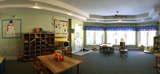
 In the large rooms, which are used for multiple purposes for each age group, we used very soft greens for paint colours. Green is the colour of balance, and play, sleep and everything in between is accomplished in these spaces. In the large rooms, which are used for multiple purposes for each age group, we used very soft greens for paint colours. Green is the colour of balance, and play, sleep and everything in between is accomplished in these spaces.
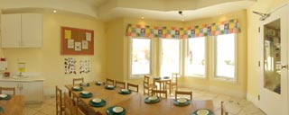
Paint colour for the lunch room is more stimulating so the children do get the variety we strive for. However, it is a soft yellow as a strong yellow can be over stimulating. Like many things, the psychology of colour is a matter of balance.
The halls & stairwells are a pale straw colour and the washrooms are a child-friendly apricot… completing the paint colours range.
Check out other commercial colour consulting projects by Colour Theory
Arimar Townhouse Colour Cosultation Project
Forest Laneway Exterior Colour Selection
The Whiteside Project
|